Home staging has become an increasingly popular practice in recent years, particularly in the United States where many people are looking to sell their homes quickly and effectively. But what exactly is it?
Home Staging in the strict sense is a marketing technique, which serves to enhance the spaces of real estate properties, improving their appearance in order to facilitate their sale or rental in a short time.
One of the key elements of home staging is the arrangement of furnishings and accessories to create a welcoming and inviting atmosphere for potential buyers. In particular, integrating paintings into a specific layout is a crucial aspect of home staging and can make a big difference in the overall look of a room. In this article, we will explore together the 5 layouts most used by American home stagers and I will leave you some tips on how to match the paintings for each layout in your home.
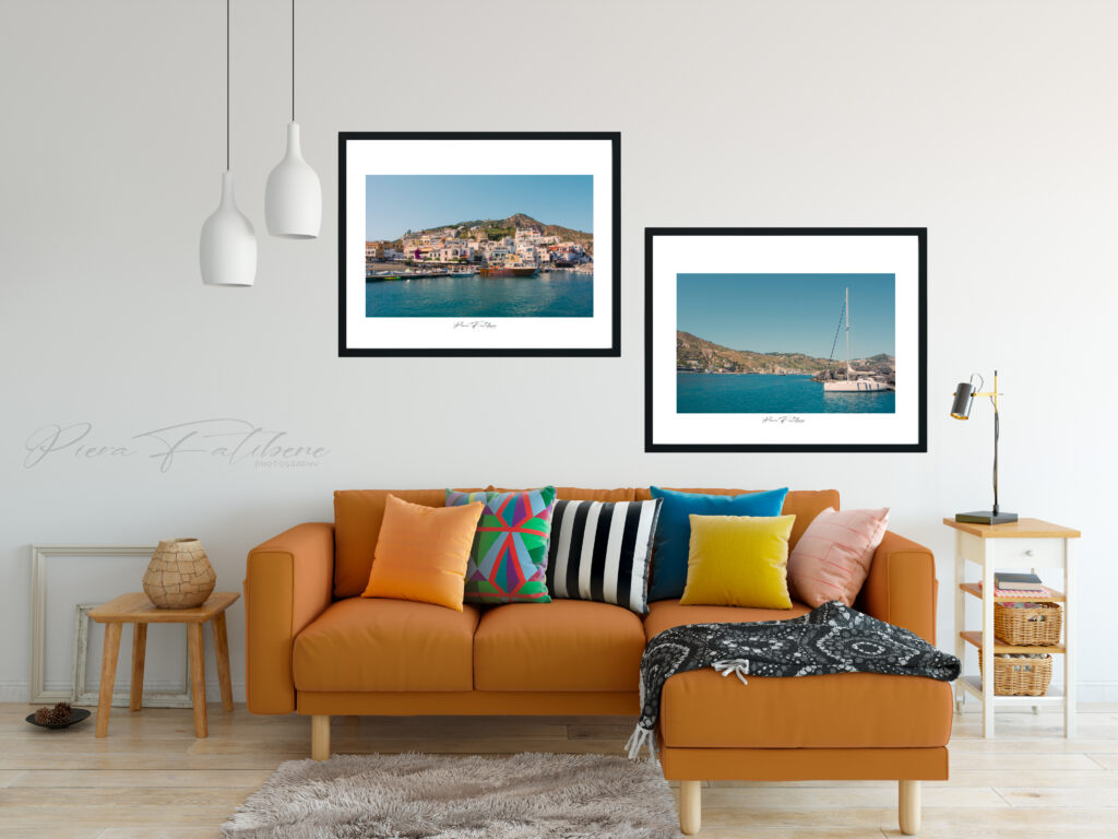
L-shaped layout:
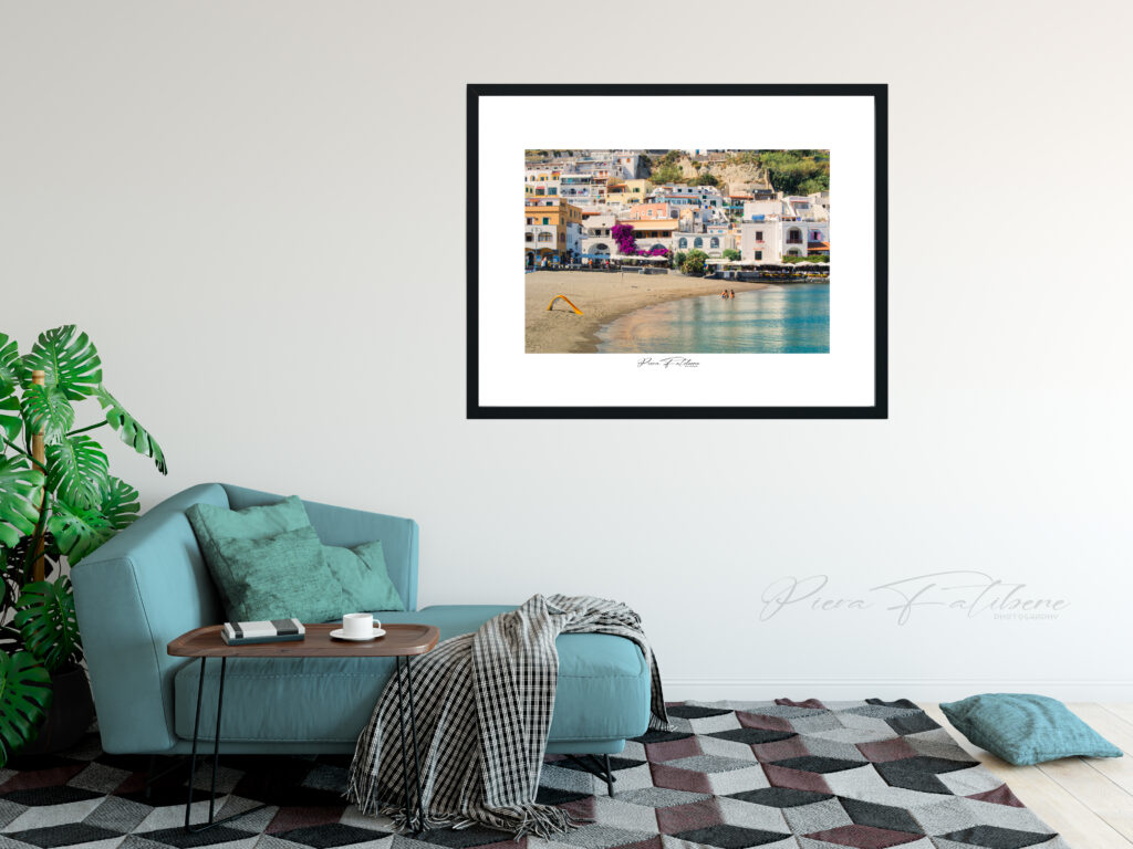
One of the most common layouts used by American home stagers is the L-shaped layout. This type of layout involves arranging the furniture and sofas to create an L-shaped corner in the room. This type of layout works especially well in large, spacious rooms, where you can create a separate conversation area and dining area.
For this type of layout, I recommend placing a large picture above the sofa to draw attention and provide a focal point to the room. Also, you can add small checks or prints to one of the sides of the L to balance out the look.
Symmetrical layout:
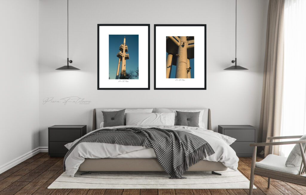
The symmetrical layout is another popular design used by American home stagers. This type of layout involves arranging the furniture symmetrically, so as to create a feeling of balance and order in the room. This type of layout works especially well in rooms with regular shapes, such as a square room.
In a symmetrical layout, it’s important to choose paintings or prints that are equal in size and shape to create an effect of balance and order in the room. Placing a picture above any sofa or bed or above a sideboard can be a good option in this case.
Opposing sofa layout:
The facing sofa layout involves placing the sofas so that they face each other, creating a cozy and inviting atmosphere in the room. This type of layout works particularly well in rooms with a central fireplace or a panoramic view.
How to place the paintings in this case? I recommend placing a large picture above the fireplace or above one of the sofas to create a focal point. Additionally, small paintings or prints can be added to the sides of the sofas to create a balanced look.
Island layout:
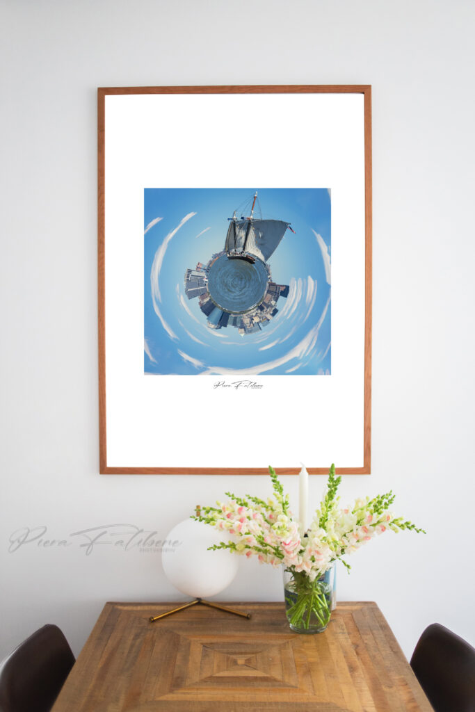
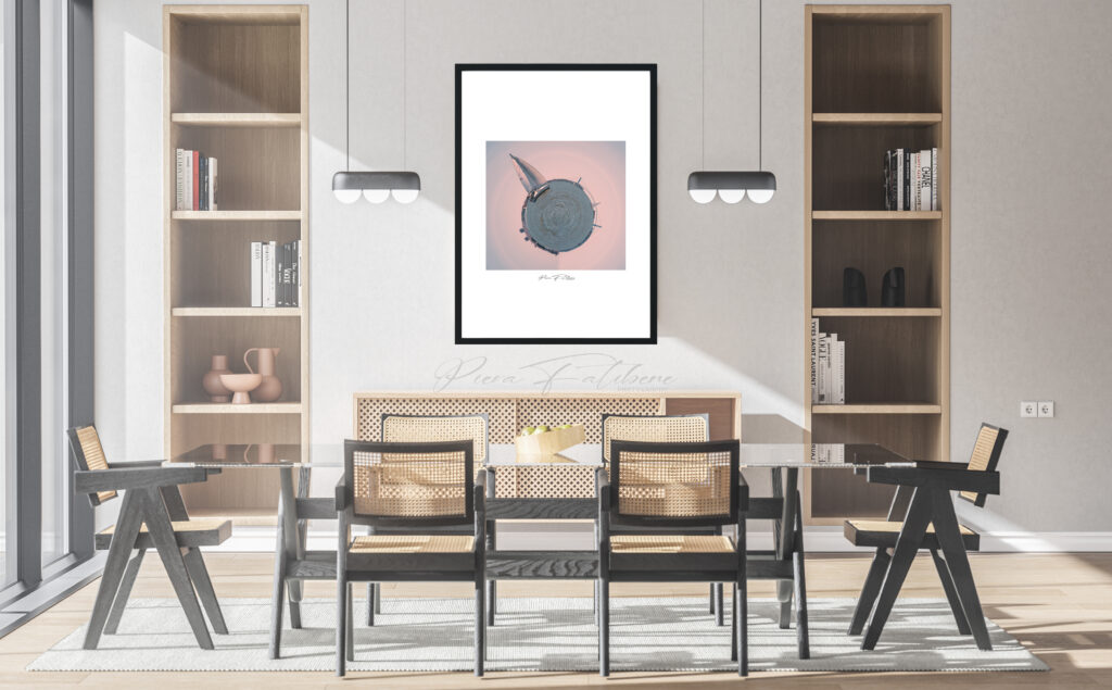
The island layout is a popular choice for kitchens and dining rooms. This type of layout involves placing the dining table or kitchen island in the center of the room, surrounded by furniture and accessories. This type of layout works particularly well in large, spacious rooms, where a separate conversation area can be created.
In an island layout, a picture can be placed above the dining table to create a focal point in the room. Alternatively, you can create a picture gallery on the surrounding walls or place a large picture above the kitchen island.
Circle layout:
The circle layout is another popular option among American home stagers. This type of layout involves placing the furniture in a circle, creating a cozy and inviting atmosphere in the room. This type of layout works particularly well in rooms with a central area, such as a fireplace or conversation area.
For this type of layout, I suggest creating a gallery of paintings or prints on the surrounding walls. You can use paintings of different shapes and sizes to create an interesting and artistic look.
In conclusion, American home stagers use a variety of layouts to create a warm and inviting atmosphere in the homes they offer for sale. The 5 most used layouts include the L-shaped layout, the symmetrical layout, the facing sofa layout, the island layout and the circle layout. Choosing the right layout will depend on the size and shape of the room, as well as your surroundings.
It is also essential to choose paintings or prints that adapt to the size of the room and the furniture present. I also remind you that it is very important to use frames that match the design of the furnishings, to create a coherent and harmonious effect. With these tips, you’ll be able to integrate paintings effectively and create an inviting look in your home.
*All the images used in this article can be found in the SHOP section of the site.
