More and more frequently today we hear talking about ARMOCROMY applied to different areas of our lives: clothing, furniture, cosmetics, but also music, art and photography.
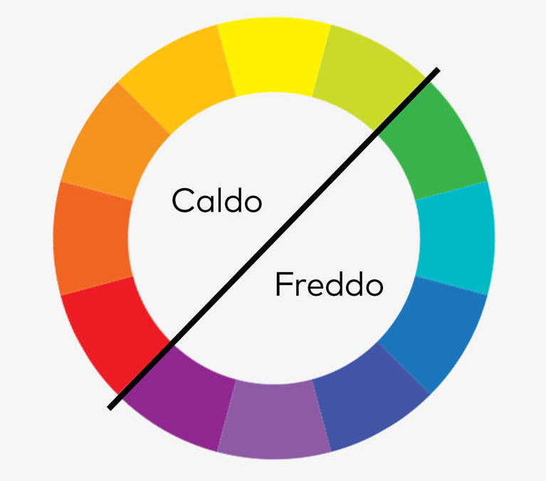
In order to talk about color harmony, first of all it is important to understand the basics of COLOR THEORY. Color theory is based on the combination of three primary colors: red, blue and yellow, which together generate all the other colors of the visible spectrum: the secondary colors – orange (red + yellow), green (yellow + blue) and purple (red + blue). Finally, there are tertiary colors, obtained by mixing a primary color with a secondary color.
The principles of color harmony are based on the choice of colors that harmonize with each other. But before you can harmonize them, it’s important to understand how each color has its own unique characteristics and can be used to express different emotions and feelings.

RED is a warm and aggressive colour; it represents energy and love, it recalls fire and passion. On the contrary, BLUE is a cold and calm colour, which recalls the sky and the sea; it is associated with peace, serenity and calmness. YELLOW is a cheerful and sunny colour, which evokes sunlight and joy, brings with it light, energy and happiness. GREEN is a natural and relaxing colour, which recalls nature and the forest, and is therefore linked to health and growth. PURPLE is a mysterious and sophisticated colour, which recalls the world of night and dreams; represents creativity, magic and spirituality.

You may be wondering what PHOTOGRAPHY has to do with all this…
Photography is an art that requires particular attention to color, since color can influence our way of perceiving images and communicating an emotion. Understanding colors and their characteristics can make the difference between a mediocre image and one that strikes the heart of the viewer. The application of color theory and the principles of color harmony can therefore make the difference in the creation of photographs with a strong emotional impact.
But how can we apply these colors to photography to express our emotions and convey a message?
Red with all its nuances is a perfect color to create a strong emotional impact in fashion and portrait images, but also in those of landscapes or nature. An example of landscape photography where red can be used successfully is that of a sunset with a fiery sky.
In photography, blue is generally used to create images of landscapes, sea and/or sky above all, but it can also be the protagonist in fashion or portrait photographs, for example by going to accentuate the eyes of the portrayed subject.
Yellow is the ideal color to create images of landscapes, flowers or architecture; in fashion or portrait photography, it helps to accentuate the brightness of the face or hair, or to “warm up the scene”.
Green is the color par excellence in landscape and nature photography; in fashion and portrait photography, it generally gives the idea of sophistication and refinement, especially if used in darker colors, while in lighter shades it can accentuate the freshness of the face or of the clothes worn by the subject.
Purple is perfect for creating fashion or portrait images. In landscape or nature photographs, it helps to create a magical and surreal atmosphere, sometimes fairytale-like.
However, a single color in a photograph is not enough to convey a message. Color harmony is just as important as choosing the colors themselves. It refers to the combination of colors that work well together.
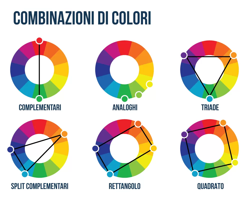
There are several techniques of color harmony, among them I mention in particular complementary harmony, analog harmony and monochromatic harmony.

COMPLEMENTARY HARMONY, for example, consists of combining opposite colors on the color wheel. For example, red and green are complementary, so they can be used together for a strong visual impact. ANALOGUE HARMONY, on the other hand, is based on the use of colors that are close on the color wheel, such as blue, purple and pink.
MONOCHROME HARMONY, on the other hand, is based on the use of various shades of the same colour.
In conclusion, for a good photographer the in-depth knowledge and application of color theory and the principles of color harmony are essential to create photographic images of great emotional impact. With a careful choice of colors and their harmonious arrangement, the photographer can convey an emotion and create an unforgettable image that lasts over time.


